How to Make Food Look Mouthwatering in Photos Using Color Grading
You know the feeling of scrolling through your social media feed and pausing at a photo that makes your mouth water? That sudden urge to reach into the photo, grab that dish and take a bite? A lot of this magic happens through something called color grading. Even if you’re not a professional photographer, you can make your food photos look just as mouthwatering with a few simple tips on color grading. Let’s dive into how you can turn your food photos from good to irresistibly tempting.
What is Color Grading?
First things first, color grading is all about adjusting the colors in your photos to make them pop, convey a mood, or enhance the overall appeal. It’s like adding the right seasoning to your dish; the right adjustments can make a huge difference.
Step 1: Lighting Matters
Before we even get to color grading, ensure your food photos start off with good lighting. Natural light works best, giving you that soft, diffused look. When the lighting is right, the colors in your photos will be more vibrant and true to life, setting you up for success in the color grading phase.
Step 2: Choosing the Right Tool
There are countless tools and apps available for color grading, from Adobe Lightroom and Photoshop to free apps like Snapseed and VSCO. Choose one that you’re comfortable with. These apps often come with built-in presets or filters that can be a good starting point.
Step 3: Enhancing Colors
This is where the real fun begins. The goal here is to make the colors in your food photo look more appealing. Play around with the saturation and vibrance sliders. Saturation enhances all colors in your photo equally, while vibrance boosts the more muted colors. Be careful though; too much saturation can make your photo look fake.
Step 4: Adjust the White Balance
The white balance adjusts the color temperature of your photo. By changing it, you can make the photo feel warmer or cooler. For food photos, a slightly warmer tone often makes the dish look more appealing and inviting. Just a small adjustment can make a big difference in making your food look yummy.
Step 5: Play with Contrast and Brightness
Adding a bit of contrast can make the colors pop and add depth to your photo. Adjusting the brightness can also help in bringing out the textures and details of the food, making it more appetizing. However, like all good things, moderation is key. Too much contrast or brightness can lose details and destroy the natural look of your dish.
Step 6: Selective Color Adjustments
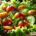
Some advanced tools allow you to adjust individual colors in your photo. This can be particularly useful in food photography. For instance, if you’re photographing a salad, you might want to make the greens look fresher or the tomatoes more vibrant. Selective color adjustments can help you achieve exactly that, making specific components of your dish stand out.
Step 7: Maintain Natural Skin Tones
If your photo includes a person, pay extra attention to skin tones. The changes you make to enhance the food should not adversely affect a person’s natural skin color. This requires a careful balance, as boosting certain colors too much might make skin tones look unnatural.
Step 8: Experiment and Practice
Lastly, the best way to get better at color grading your food photos is to practice. Experiment with different adjustments, understand what each slider does, and don’t be afraid to try something new. With time, you’ll develop an eye for what works and what doesn’t, and your food photos will start looking more appealing with every attempt.
Conclusion:
Color grading is a powerful technique to enhance the appeal of your food photos, making them look more mouthwatering and inviting. By following these simple steps and experimenting with different tools and adjustments, you’ll soon be able to capture food photos that not only look delicious but also evoke a desire to dive in and enjoy the meal. Remember, the goal is to make your viewer feel hungry, so have fun with it and let your creativity lead the way.