Unlock the Secrets of Color Contrast for Vibrant Food Photography
Food photography is an art that captures the beauty and allure of food, inviting viewers to taste with their eyes. One of the most powerful tools in a food photographer’s arsenal is color contrast. Mastering this can transform your food photos from good to utterly irresistible. Let’s dive into how you can use color contrast to make your food photography vibrant and captivating.
What is Color Contrast?
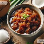
Color contrast involves using complementary colors or colors from opposite sides of the color wheel to make your subject stand out. It’s all about how different colors play off each other to create a visually striking effect. Think of the vibrant green of basil on a classic red tomato sauce pizza. That’s color contrast in action!
Why is Color Contrast Important in Food Photography?
In a world where we feast with our eyes first, making your food pop is crucial. Color contrast:
– Grabs attention: Bright, contrasting colors stop people from scrolling and make them look closer.
– Evokes emotions: Colors can make people feel hungry, refreshed, or even nostalgic.
– Highlights the subject: By using contrasting colors, you can guide the viewer’s focus to the main subject of your photo.
How to Use Color Contrast for Vibrant Food Photography
Here are some practical tips to harness the power of color contrast in your food photography:
-
Understand the Color Wheel: Get familiar with the color wheel. Knowing which colors complement each other will help you make intentional choices when setting up your shots or editing them.
-
Use Complementary Colors: Complementary colors are opposite each other on the color wheel. They include pairings like red and green, blue and orange, or yellow and purple. Using these combinations can make your food stand out dramatically.
-
Consider Your Background and Props: Don’t just focus on the food. The colors of your background, plates, and utensils can all contribute to the overall contrast of your photo. Choose them wisely to complement or contrast with the food.
-
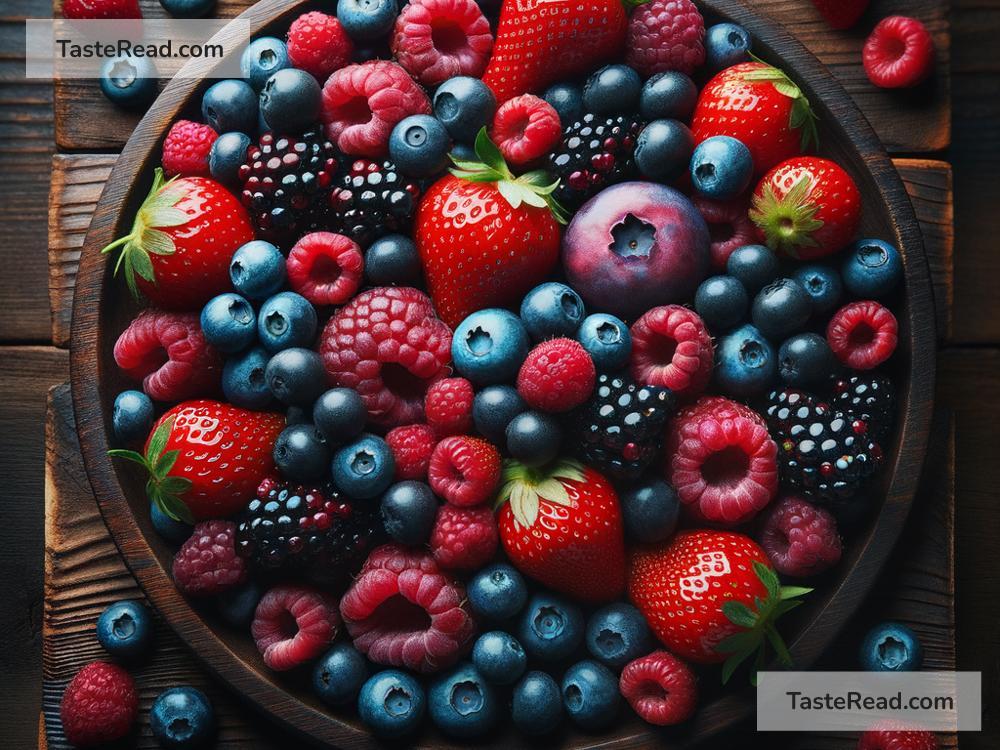
Play with Natural Colors: Sometimes, the natural colors of your ingredients are all the contrast you need. Bright fruits, vegetables, and even herbs can provide a splash of color against more neutral-toned foods.
-
Edit for Vibrance: Use photo editing software to subtly enhance the colors in your photos. Adjusting the vibrance and saturation can make the colors pop without looking unnatural.
-
Use Light to Your Advantage: Lighting can affect how colors appear in your photos. Natural light tends to show true colors, while artificial light can introduce yellow or blue tints. Experiment with different lighting sources to see how they affect color contrast.
-
Experiment and Practice: The best way to get better at using color contrast is to practice. Experiment with different combinations, take lots of photos, and don’t be afraid to try something new.
Examples to Inspire You
- A bowl of creamy pumpkin soup garnished with a swirl of cream and fresh green parsley? That orange-green contrast will make the soup look even more inviting.
- Think of a bright purple acai bowl topped with slices of kiwi, strawberries, and yellow mango. The mix of purple with red, green, and yellow not only looks vibrant but also mouth-watering.
- A simple spaghetti dish can be transformed with the bright red of cherry tomatoes and the dark green of basil leaves. The red-green contrast here adds depth and appeal.
Final Thoughts
Using color contrast in food photography isn’t just about creating beautiful images; it’s about telling a story and engaging the senses. With these tips, you have the knowledge to start experimenting with color contrast in your own food photography. Remember, the goal is to make your viewers feel like they can almost taste the delicious food through their screens. So grab your camera, play with colors, and watch your food photography come to life with vibrant hues and tantalizing contrasts. Happy shooting!