How to Use Color Theory to Enhance the Aesthetic of Food Photography
In the enchanting world of food photography, colors play a pivotal role in turning an ordinary meal into a mesmerizing spectacle. Have you ever wondered why some food photos seem to leap out of the screen inviting you to take a bite, while others fall flat? The secret often lies in the thoughtful application of color theory. This guide will take you through the basics of color theory and show you how to use it to enhance the aesthetic appeal of your food photography.
Understanding Color Theory
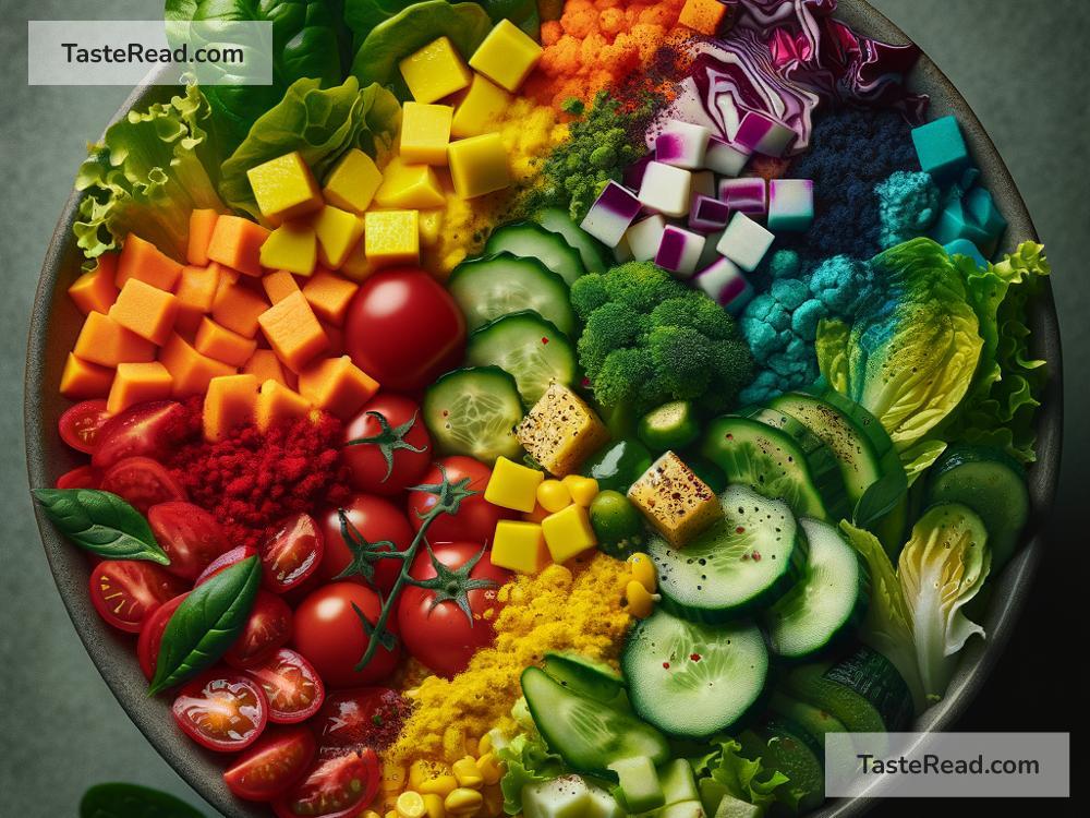
At its core, color theory is a science and art technique used to determine what colors look good together. It’s based on the color wheel, which showcases colors in a circular layout. This wheel is your treasure map in the world of food photography, guiding you on which colors complement or contrast each other beautifully.
The Color Wheel and Its Magic
The color wheel can be divided mainly into three categories: primary colors (red, blue, and yellow), secondary colors (green, orange, and purple), and tertiary colors. By understanding these divisions and how colors relate to each other, you can create stunning visual harmony or striking contrasts in your photos.
Complementary Colors
Complementary colors sit opposite each other on the color wheel. Think red and green or blue and orange. When used in food photography, these colors create a vibrant look that makes the image pop. For example, imagine photographing a dish with tomatoes on a vibrant green basil background. The red and green complement each other, making the dish look even more tempting.
Analogous Colors
Analogous colors are next to each other on the color wheel, such as red, orange, and yellow. Using these colors together creates a harmonious and soothing visual effect. Consider the warm, comforting allure of photographing a pumpkin pie with a dollop of cream – the oranges and yellows invite a sense of happiness and contentment.
Using Color to Set the Mood
Colors evoke emotions. Warm colors like red, orange, and yellow can evoke feelings of warmth, passion, or joy, while cool colors like blue, green, and purple can evoke calmness, freshness, or mystery. By selecting props, backgrounds, and even table settings in colors that complement the food, you can control the mood of your photographs. Want to make a smoothie seem even more refreshing? Try using a blue or green background.
Contrast and Saturation
Contrast and saturation are also key elements of color theory that can dramatically impact your photos. High contrast colors make your images stand out, but be careful not to overwhelm your viewers. Similarly, playing with the saturation of colors can either enhance the vibrancy of your dish or create a more subdued, elegant look.
Practical Tips for Applying Color Theory in Food Photography
-
Plan Your Palette: Before you start shooting, decide on a color scheme. This will help you select backgrounds, props, and even ingredients that harmonize or contrast beautifully with your main dish.
-
Experiment with Backgrounds and Props: Invest in various colored backgrounds and props. Simple changes can dramatically affect the mood and appeal of your photographs.
-
Understand the Color of Light: Natural light has a different quality and color at different times of the day. Soft morning light can add a warm glow, while afternoon light might give you cooler tones. Use this to your advantage.
-
Edit with Purpose: Post-processing is a perfect time to adjust the colors in your photos. Use editing tools to tweak the saturation and contrast to get the exact look you’re after.
-
Practice and Experiment: The more you practice, the better you’ll become at intuitively knowing which colors work best together. Don’t be afraid to experiment and learn from each shot you take.
Implementing color theory in your food photography isn’t just about making your food look good; it’s about telling a story and evoking an emotional response from your viewer. Whether you’re aiming for a photo that feels warm and comforting or fresh and invigorating, the right colors can help you convey the exact feeling you want your audience to experience.
By understanding and applying the principles of color theory, you’re equipping yourself with a powerful tool to enhance the aesthetic appeal and impact of your food photography. So the next time you’re planning a food shoot, take a moment to consider the colors. With practice and patience, you’ll start to see your food photos in a whole new, vibrant light.