Mastering the Use of Color in Food Photography: A Simple Guide
In the world of social media, food photography has become an art form of its own. Whether you’re a professional photographer, a food blogger, or just someone who loves sharing your meals online, you understand the power of a great photo. One key element that can make or break your food photography is the use of color. Mastering color can elevate your photos from good to mouth-watering. Here’s a simple guide to help you use color effectively in your food photography.
Understanding Color Theory
Before diving into how to use color, it’s important to have a basic understanding of color theory. Color theory involves how colors interact and the feelings or moods they can evoke. For instance, warm colors like red, orange, and yellow can evoke feelings of warmth and comfort, while cool colors like blue and green can create a refreshing and calm mood.
The Role of Color in Food Photography
In food photography, color does more than just make your photos look pretty; it can also affect how appetizing the food appears. The right color combinations can make your dish pop and trigger those “must-eat” feelings, while the wrong combinations can make food look unappealing.
Tips for Using Color Effectively
- Use Complementary Colors
-
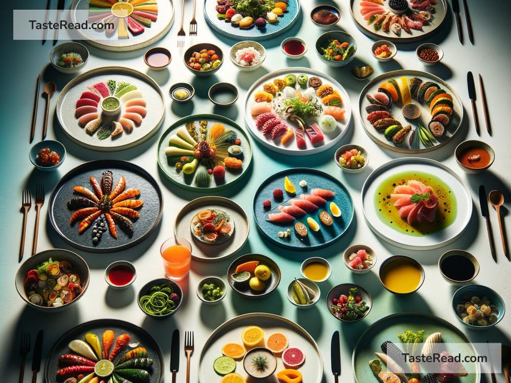
Complementary colors are opposite each other on the color wheel and can create a high contrast that really makes your food stand out. For example, using a blue plate for orange foods like sweet potato fries can make your photo more vibrant.
-
Consider Background and Props
-
The colors of your background and props play a crucial role in highlighting the food. Neutral colors like white, gray, or light wood tones can make the colors of the food stand out without competing for attention.
-
Play With Colorful Foods
-
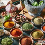
Take advantage of naturally vibrant foods. Fresh fruits, vegetables, and bright sauces can add pops of color to your shots and make them more appealing.
-
Think About Color Balance
-
While it’s great to have pops of color, balancing these with more subdued tones can create a more harmonious and pleasing photo. If your main dish is colorful, consider using neutral colors for your sides or background.
-
Adjust Saturation and Brightness
-
Sometimes, you might not get the colors exactly right in-camera. That’s where editing comes in. Adjusting the saturation and brightness of your photos can help make the colors pop, but be careful not to overdo it. You want your food to look appetizing, not unnatural.
-
Pay Attention to Natural Light
-
Natural light can significantly affect how the colors in your photo appear. Soft, diffused natural light can help bring out the best in your food’s colors.
-
Experiment With Color Gradients
-
Using a color gradient (where similar colors are arranged from lightest to darkest) can create a visually appealing composition that draws the viewer’s eye across the photo.
-
Mood Setting with Color Temperature
- The temperature of a color can set the mood for your photo. Warm colors can create a cozy and inviting feeling, making your food look more delicious, while cool colors can create a fresh and light mood.
Putting It All Together
Mastering the use of color in food photography may seem daunting at first, but like any skill, it gets easier with practice. Start by observing the work of photographers you admire and see how they use color. Experiment with different combinations and settings to see what works best for the dish you’re photographing.
Remember, the goal of food photography is not just to show off a dish but to tell a story and evoke an emotion or desire. The use of color is a powerful tool in your arsenal to achieve just that. So, don’t be afraid to experiment and play with colors in your photography. With practice and attention to detail, you’ll soon be taking vibrant, appetizing food photos that stand out in any feed.