Unlocking the Palette: Using Color Theory in Food Photography for Balanced Compositions
In the world of food photography, capturing the essence and appetizing nature of your subject goes beyond just having a high-quality camera and a keen eye for detail. The secret ingredient to creating those mouthwatering images that make viewers want to dive right into the plate is often found in the thoughtful application of color theory. Just as a chef uses an array of flavors to create a balanced dish, photographers can use colors to bring harmony and vibrancy to their compositions. Let’s break down this concept into bite-sized pieces so you can easily apply these principles to your food photography projects.
What Is Color Theory?
At its core, color theory is an intricate subject that dives deep into the psychology and science of how colors interact with each other and how we perceive them. But don’t let that complexity scare you away! For our purposes, we’ll focus on a few basic principles that can dramatically uplift your food photography.
The Color Wheel and Its Importance
Imagine the color wheel as your palette from which you can draw combinations that work well together. It’s divided into primary colors (red, blue, yellow), secondary colors (green, orange, purple), and tertiary colors (the blends between primary and secondary colors). How these colors are used in combination can either make your photo pop or flop.
-
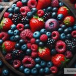
Complementary Colors: These are colors opposite each other on the wheel, like red and green. Using them creates a vibrant look, but handle with care to avoid color clashes. This contrast can make a dish stand out – imagine a fresh green salad with cherry tomatoes.
-
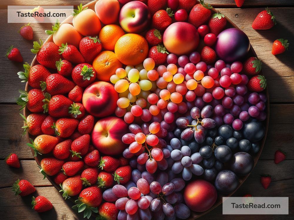
Analogous Colors: These colors sit next to each other on the wheel and share a common hue, creating a serene and comfortable design. Think of a citrus-themed image with oranges, lemons, and limes – pleasing to the eye and very natural.
-
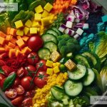
Triadic Colors: Three colors evenly spaced on the wheel. This scheme offers a vibrant yet balanced feel if you manage the colors’ intensity well. A plate of colorful macarons could serve as an appetizing example of this approach.
Balancing Act: Harmony in Composition
With the color wheel as your guide, you’re set to start applying these principles to your food photography. However, knowing the theory isn’t enough; mastering how to balance these colors within your composition is key to creating visually appealing images. Here are some tips:
-
Mind the Background: Your choice of background can make or break your shot. A neutral background can help brightly colored foods pop, while a thoughtfully chosen colored backdrop can complement your subject and make it truly shine.
-
Use Props Wisely: Props can introduce complementary or analogous colors to your composition. This might be a brightly colored napkin, a piece of rustic wood, or an antique silverware piece. Be mindful not to overcrowd your scene; the food should always be the star.
-
Adjust Colors in Post-Processing: Sometimes, despite your best efforts, the colors in your photo might not turn out as vibrant or balanced as you hoped. This is where editing software comes into play. Use it to adjust the saturation, brightness, and contrast to bring out the best in your colors.
-
Telling a Color Story: Every dish tells a story, and color is a powerful narrative tool. Whether you’re going for a warm, comforting feel with earthy tones or a fresh, vibrant vibe with bright and airy colors, ensure your color choices align with the story you’re aiming to tell.
Practice Makes Perfect
Like every art form, mastering the use of color in food photography takes practice. Start by observing the world around you – how colors interact, how they make you feel, and how they draw your attention. Experiment with different color schemes, backgrounds, and lighting conditions to see firsthand how these elements affect the overall mood and appeal of your photographs.
Remember, rules in art are more like guidelines – don’t be afraid to bend them and experiment. Your unique style will develop over time, and with it, a keen sense of how to use colors to bring your culinary stories to life.
Embarking on a journey through color theory in food photography opens up a world of creativity. It’s not just about creating pretty pictures – it’s about engaging the viewer on a sensory level, making them almost taste, smell, and feel the dish through your image. By thoughtfully applying these principles, your food photography is sure to leave a lasting impression, making mouths water and eyes widen with every shot you take.